I linked all my artefacts together as a whole series story about Puppet. I am quite satisfied with this project, the final feedback was better than what I expected.
The fifth artefact in fact is a transitional part, which mainly functions as a link between the first and second artefacts. Unlike other five artefacts, there is no designed surprise in this short, coupled with no particular gag. When originally planned it, I tried to apply more actions of the role to represent its real thought.
My initiatory design was as follow: the first artefact talked about an accident that a refrigerator dropped unexpectedly on the puppet’s foot, and the follow artefacts basically centered on how the puppet managed to wrestle the refrigerator home. On the basis of these, I wanted to create a special artefact which serves as a link to connect all these plots logically.
This artefact continued on the top of the first. After the refrigerator fell, the puppet hit upon the idea for carrying it home because he thought it’s perhaps a present the god gave him. However, owing to the weight of the refrigerator, he had to make every manful effort to move it. At this juncture, a kind-hearted passer-by approached to ask if he could help him. As this is obtained by dishonest means, the puppet felt a little guilty and didn’t want people to ask about it. As a result, he turned down the passer-by’s help. Due to limited creating time, it’s impossible for me to re-rigging another new character, so I used a good method for saving time. I just changed the colors of the hair and eyebrows of the former puppet. Therefore, this new puppet, with dyed blond hair and eyebrows, would be the figure of the kind passerby in fifth artefact.
I adopted a two-person animation when producing, and this was also my first try, which I guess worked out all right. Meanwhile, it was not very difficult for me to operate it. Two-person animations means that after merging two characters into the scene, I should adjust the action of leading role firstly, and then arrange the kind-hearted passerby’s. In this process, I need to calculate the time that the passerby costs when he approached to the leading character. In addition, I needn’t produce special action about his walking, but just need to drag the role and then test the appropriate speed and distance when he enters the scene. When all these are completed, what I should do is re-adjust the animation.
In spite of no planned special accident, this two-person short still serves as an important link, which makes the whole story more coherent and logical. Meanwhile, exaggerated body language and mutual actions of two persons can make the audience more understood what I wanted to express, and add a touch of easy and humor.
I am pleased with this project, although there were some details need to imporved such as lighting and layout of the interior design. I think this project has achieved my aim which is to demonstrate the personality of otaku. :)
The first time I watched cartoon pocoyo was in my second year animation seminiar. Although it is pre school animation cartoon series, I am attracted by this inquisitive and fun-loving little boy. Through the character design to every tiny props design, all the things look like lovely and diaphanous. The characters are extremely smooth looking. The style of the whole animation is quite similar to my work. I intend to keep the background and props as simply as possible.
I saw the prevue of Kung Fu Panda on Youtube. It looks like the best animated film in the summer 2008. The movie is about a panda who learns martial arts and then uses this new ability to fight his enemies. directed by John Stevenson and Mark Osborne and produced by Melissa Cobb. The stroy, designs and soundtrack are all awesome. The idea for the film was conceived by Michael Lachance, a DreamWorks Animation executive. The film is due for release on June 6, 2008. It will be distributed by Paramount Pictures. I really can't wait to see this movie.
The plot of my fourth artefact describes the puppet tried his best to move the refrigerator back home. He is quite happy and whist he finds a socket on the wall. So he wants to test the refrigerator and to see if it works. However he can’t find the plug at the moment.
Through this short humours animation, I intend to explain the anticipative psychology of audience. It means that the person stop to performance temporarily when an accident accrued to a person. Time is left to the audience to think about the consequent things and actions. When the person performs the result to the audience, the audience will feel surprise and the result is reasonable as well. In the other words, it can be simple explained that unexpected scenes are seen in the animation, while the consequences arising there from usually go against the common sense. This is the charm of the animation.
Let’s take my artefact for instance, the puppet is glad to remove the refrigerator back to home. When he immerses himself in his joyance, the accident happens. There is a close-up before the final answer has been reveal. The audiences could be guess what’s happened to the ending at this moment. Finally the consequence is that he can’t find the plug of the refrigerator that means all the things he did is ineffectual.
I think the anticipative psychology is the most common technique skill which is used to employ the funny elements in the animation. The anticipative psychology always combines with exaggeration thereby emphasis the impression of humor to audience.
I also used abundant facial expression to explain the inner emotion of character. In this artefact, I tried to make the facial expression looks more real. In the other words, I didn’t adjust eyes; bows and mouth reach the same key. Moreover, for expression, right-and-left asymmetry is applied, which mainly represents on character’s eyebrows and mouth. In my previous artefacts, expression used to reach the designated position, which was quite rigid. Staggering them slightly makes character’s expression naturally.
If you goole the name David Lanham, you wil find that people always called him "Icon Master". I think this appellation is very suit for him. He is one of the most popular Mac designers today, best known for his icons and illustrations on his website, his two themes Amora and Somatic, and the designs for sites My Dream App and MacThemes 2.0 (along with Renato Valdés Olmos). He currently works at the Iconfactory, creating freeware icons as well as commercial designs for clients like MacPractice, Sybase and Microsoft Xbox 360.
There are some works of Daivd Lanham, if you are interested in his art design, you can go to his blog.
The texture of my character has been finished. I am very satisfied with it. The next step will be adjust the morphy facial expression for my otaku. I hope the time will be enough.
For my third artefact, I still intend to create a little piece of humor animation movie clip. How could made the story be continued from my second one is the big question before I design this third artefact. My initial narrative idea is represented the character run down the door. However when I told this idea to my friends, almost of them don’t think it will be funny. I decided to do change my story of my third artefact.
The final story is talking about the character was hit his private parts when he opens the door. I am really satisfied with this artefact. The camera views and the expression of character are apropos. The gag is more attractive than the previous two. This artefact received a lot of laugh from the audience. Therefore I think my third artefact is successful.
The first part of moving the fridge away the door is let the story link with my second artefact. The movement has been adjusting slowly in order to show the weight of refrigerator. The exaggeration has also been used widely in this artefact. For instance, when the character tries to open the door, he put his foot on the wall and bends his back. The exaggeration is also used in the facial expression. For example, when the puppet hit the door, I created the grandiloquent reaction on character’s face.
The camera lenses play the important role in this artefact as well. I set close-up scene on the puppet’s private part and the sorely facial expression. These two close-ups give audience more space to imagine the consequence. At the end I changed the diffuse color to red on puppet’s face. It helps the whole ending looks more attractive.
Because of the techniques skills I mentioned above and the interesting plot, the third artefact has gained a lot of positive comments from people.
I wanted Alvin and Chipmunks last week. It's a mix of CGI and live action film, is a lightweight, modestly pleasing family comedy. It is sweetness, energy and silliness that will likely please its pre-teen younger target audience while never fully losing adults who can remember the early days when all of the Chipmunks.
The film is directed by Tim Hill and produced by Bagdasarian Productions, New Regency Productions, and 20th Century Fox. The film has recieved extremely negative reviews from movie critics, but has proved to be a huge financial success, making over $210 million to date in North America alone and nearly $330 million to date in total worldwide reciepts.
"THIS FILM IS DEDICATED TO ROSS BAGDASARIAN,SR. WHO WAS CRAZY ENOUGH TO INVEBT THREE SINGING CHIPMUNKS NEARLY FIFTY YERS AGO." This words were dispalyed at the end of the film, make me think of the TV cartoon shows I have watched when I was a child. It bring back so many childhood memories for me.
Altough the plot of the film hasn't innovated, the cute character design and fantastic soundtrack will inject the new energy for this film. In any case, I think it is a good animated film.
Alvin and the Chipmunks is a five-time Grammy Award-winning animated music group, created by Ross Bagdasarian, Sr. in 1958.The group consists of three singing animated chipmunks: Alvin, the mischievous troublemaker, who quickly became the star of the group; Simon, the tall, bespectacled intellectual; and Theodore, the chubby, impressionable sweetheart. The trio is "managed" by their human "father" and confidant, David Seville.
The voices of the group were all performed by Bagdasarian, who sped up the playback to create higher pitched, squeaky voices. This oft-used process was also not entirely new to Bagdasarian, who had also used it for a previous novelty song project, "The Witch Doctor", but it was so unusual and well executed it earned the "trio" two Grammy Awards for engineering. Although the characters were fictional, they did release a long line of "real" albums and singles, with "The Chipmunk Song becoming a number-one hit single in the United States. Since Ross Bagdasarian, Sr.'s death in January 16, 1972, their voices were performed by Ross Bagdasarian, Jr. and Janice Karman in all subsequent incarnations except for the 2007 CGI/live-action film adaptation, when they were voiced by Justin Long, Matthew Gray Gubler and Jesse McCartney respectively.
The new Coke Cola advertisenment "It's mine", combines live action and computer animation. UnderDog, Stewie from Family Guy, and Charlie Brown character balloons from the Macy’s Thanksgiving Day Parade battle it out for their coke. I looked at this animation ad at MSN video. It's awesome. I searched youtube then found the embed address. I pasted it below, hope you guys will interested in this wonderful animation.
Dan Wieden and David Kennedy made Super Bowl history by having four spots airing, including a new campaign for CareerBuilder.com.
The commercial was produced and designed by Wieden + Kennedy, with Creative Directors Hal Curtis and Sheena Brady.
I found these character design pic on the web. I think the it might be helpful for my character of client project. I will use these pictures to be the references then improve my original character design.
The character I put uppon, has some details I think I could use to be the refrence in my deisng work. Such as the black fram glasses and fat bingy. However this character looks very smart and claim, mine will looks like more messy and nutsy. I think this character picture will give me some idea for improve my original design.
The picture below is another 3D character design work on website. The character looks decadent, I consider my character should be remain this decadent style as well.
It's my basis character design for my client project client. But it's unshaped. I will put more details on this character in the next couple of weeks.For instance, 1. The cloth should be changed in order to present the personality of Otaku. (shorts, slipper and vest will be the final decision for the dressing) 2.The whole style of the character should be more cartoon 3.The texture should be applied
Brief: Create a character then portray it through an animation to express its personality Contents of Project: 1. Storyboard which should present general idea of the script and succinctly show the process of how created the character 2. Animation final piece (2-3mins)
The aim and objective of the project The aim of my live client project is to create a character then portray it through an animation to express its personality. I want to make the animation more interesting with the aid of a humorous narrative and character design.
The concept behind the project and narrative plan:
My narrative idea is represented a Otaku who purchases comic toy on ebay。
The story happens in a disordered room which is full of comic books and computer games. A Otaku, who has dishevelled hair, dressed dingy clothes, beard and wears a pair of large black frame glasses, is sitting before a computer, with excitement and joy in his eyes.
He finds a limited edition cartoon toy on ebay and he has looked for it for many years. He presses “enter” key without hesitation to purchase it. When he is immersing in happiness, he finds that someone is also purchasing the toy. So, the price is getting higher and higher, which makes him anxious and angry. At this time, the price has up to an extraordinarily high level.
After he presses “enter” key for another time, he finds his rival stops, and he finally successfully purchases the limited edition cartoon toy model with an unimaginable price. He is relaxed after successfully purchasing it, so he continuous browsing other objects for auction randomly as usual. Suddenly, he finds that there is a similar model toy on the website, but the price is much lower than that he just spent on his toy.
Character Design:
A man with: Messy hair style Never clean up the room Don’t like have a shower Dress out of style, sluttish Interested in comie and Computer games Collect toys of comic and computer games\
Environment and Prop Design:
Basis props: bed, desk, TV table, X-box or PS2, bookcase, chair, comic and computer game posters
A messy room, full of the comic books and computer games
Otaku is a derisive term used to refer to people with obsessive interests, particularly anime manga and computer. In modern Japanese slang, the term otaku refers to an overtly obsessive fan of, or is specialized in any one particular theme, topic, or hobby. Common uses are anime otaku (one who sometimes enjoys many days of excessive anime watching with no rest) and manga otaku (a fan of Japanese graphic novels), pasokon otaku (personal computer geeks) and game otaku (playing video games).
In the other words, the otaku could be simply described that a man who is not adept in social, always enjoy taking the activity alone and likes stay at home.
The brief of PRP in term 2 requires us create 6 artefacts. It meant that we should through these artefacts to prove our research work. Obviously, my artefacts should be related with comedy and humorous in animation. I have decided to research into technique and method on how to represent humour in the animation. It might sounds a little inexplicit, but I believe it will be understood through the 6 artefacts.
I will use my puppet character and refrigerator to create series short animation clip. In terms of these six artefacts to analysis the methods of representing humour in animation.
Through the improvement, my first artefact has already completed. The camera views and sequel has been changed. The object of my artefact is that to see how to use different ways to present humorous in animation.
The story of my first artefact is base on my human being character and the prop is a refrigerator. A man was walking along a road. Suddenly a refrigerator fell down. The man touched his head by habit. It was lucky that his head was not wounded. But when he looked down, he found his foot was hit by the refrigerator. Meanwhile he screamed out because of the pain. The volume of sound was very high so as to make the refrigerator fall down.
Obviously, The gag of this animation is the ending. The man screams out because of the pain of his foot. The refrigerator has been pushed over by the loud scream. The exaggeration of story could be seen visibly from this artefact. I exaggerate the power of the voice in order to present the how much pain the man suffers from the refrigerator. Through this exaggeration method the whole animation will be let audience feel funny and humours.
There are varieties of exaggeration can be used in animation. For the following artefacts I will try to engage different exaggeration method to present humorous in the animation.
I really want to recommend this humourous animation. The cartoon show Usavich is a series of short films, which are completely animated and was produced by Kanaban Graphics for MTV Japan since the year 2006. The story of the cartoon series revolve around a number of odd lovable rabbits which are being imprisoned in a Russian prison.
In the first season of the cartoon series the makers depicted the daily occurrences of the imprisoned life of the two rabbits. The portrayal of the regular life of the rabbits is also done with much dexterity and the audiences seem to enjoy it all the more. The second series of the show however portrays the adventurous circumstances under which they escape and takes their life on the run.
Usavich is really worth watching a comedy. It is also described by some as a bizarre series. The fusion of 3D animation and the traditional 2D illustration is really a thing which deserves special praise about this series. It is always expected that you will imbibe hallucinogen of choice while watching this series. The funny little creatures involving themselves in a series of adventurous twists and turns really makes the audience especially the children sit back and take notice of them.
There is the offical link for Usavich: http://www.usavich.tv/ if you are interested, you should go to that website to see this fantastic animation
The brief of PRP in term 2 requires us create 6 artefacts. It meant that we should through these artefacts to prove our research work. Obviously, my artefacts should be related with comedy and humorous in animation. I have decided to research into technique and method on how to represent humour in the animation. It might sounds a little inexplicit, but I believe it will be understood through the 6 artefacts.
I have decided to create a human being character that is fully rigged and has the facial gestures. I will use him to be the protagonist in the following six artefacts. I will also produce some accessorial models, such as plant, architecture and prop.
For my first artefact, I will produce a short piece funny animation. The story is base on my human being character and the prop is a refrigerator. A man was walking along a road. Suddenly a refrigerator fell down. The man touched his head by habit. It was lucky that his head was not wounded. But when he looked down, he found his feet was hit by the refrigerator.
Through this short humours animation, I intend to explain the anticipative psychology of audience. It means that the person stop to performance temporarily when an accident accrued to a person. Time is left to the audience to think about the consequent things and actions. When the person performs the result to the audience, the audience will feel surprise even though the result is reasonable. In the other words, it can be simple explained that unexpected scenes are seen in the animation, while the consequences arising there from usually go against the common sense. This is the charm of the animation.
For my other artifacts, I will use this character to create 6 different japes in animation and demonstrate different humor elements in the animation.
My previously idea for my first artefact is to create an animal character and then I will use this character to produce some simply short and funny animation. The below picture is the scene shot from 3D Max of my Rabbit charater. However there are some limitation of this charater which I didn't consider about when I designed it. Firstly the head is too big. Secondly the foot is too long. These limitations will let rigging and adjusting animation performance be very hard. Therefore I have changed my mind. I have given up the rabbit, instead of I created human being character to be my protagonist of my six artefacts .
I quite like this story which is for a insect spray adv. Although some of my friend said it's infantility, I don't care about. I think it is really funny and I quite enjoy to producing this kind of animation. hahaha~~ Just post and share this 30sec short animation adv storyboard to people. Sorry about silence, coz it's just require for the storyboard, so I didn't put any sound track at background. Hope you will like it and enjoy it!
For the simulate client project we are require to produce a storyboard that conveys the plot and action of animated 30 second advert that informs, entertains and sells insect repellent (no more than 20 frames). The advert must contain a 3 second “ pack shot” at the end.
The aim of my project is to produce a storyboard for an advert sells an insect repellent product in a fun and facetious way. I want to make the advert more interesting with the aid of a humorous narrative and character design. My target audience has no age range it will appeal to both adults and children.
My narrative idea is represented the powerful effect of the insect spray and portray the substance of a good insect repellent.
According to the overall theme, the story is based on two all out conflict Spiderman. The one will dress the normally Spiderman cloth which people are familiar with. The other will wear a black cloth. The Black Spiderman represents felonious. The Red Spiderman is righteous. They are fighting with each other. I will produce the cartoon style Spiderman in order to give the light hearted, cute and funny mood to audiences in this advert. There will be various battle scenes between two Spiderman and they will be more comical than serious. The Black is very jesuitical, he wants to frame the Red one. So he throws a little piece stone on the ground while the Red one runs towards him. Then The Red falls down on the floor. In the mean time, The Black steps his foot on The Red’s head. The Red Spiderman seems to lose in this fight. In the urgent moment, The Red takes an insect repellent from his pocket and sprays it towards The Black’s face.
The final year of my university is a really busy year, I even forget to post any progress of my work on my journal. Hope it won't be too late to post my stuff on the blog. Fingercross xxxxxx.
The last project we were given for Advanced Animation was to create a short narrative animation.
From the start of the project, there had been a number of changes to my storyboard. My initial idea was to create a story about turtle and rabbit. However due to the enormous workload and limited time, I felt that almost the design would not work. Finally, I selected a topic about skipping class. The reason for choosing this theme is I think it will easily get responses from students. My story basis outline is of a turtle getting up later and lies about real reason of absenting the classes.
I created one animal character which is turtle, exterior environment and indoor scene for this story. The character is not a very difficult model. However I feel the final outcome of my model is slightly different as I imagined at the beginning. I thought the turtle must be very cute but when I showed the turtle to my friends, all of them said it is a dinosaur. I found it was hard to see the mouse while I set the camera in front of the turtle. The whole character just looks like a green egg with a pair of eyes. Therefore I had to put the turtle head a little bit higher in the screen shooting.
The exterior environment is consisted of a house, banana mailbox, trees and fense. I am very satisfied with these props and I put them at the beginning of the whole story. This exterior environment could explain the place where this story happened and I think it is good enough to attractive the audiences to watch the following scenes. Obviously, the indoor scene is not as good as the exterior. It is very simple, only consist of a bed, bureau, clock and chair.
The story should express several emotions such as panic (when turtle see the clock and find he was late for go to university); and silliness (when turtle try to dress his shell but make it in reverse). So the morph tool is one of the most important techniques I used in this animation. I have created totally 12 differnet motion in this animation.
There were no big problems in my turtle character. The rigging works fairly well. The only regretful thing was I didn’t use particle effects in this animation.
For the sound of the animation, the all clips were provided by http://www7.flash8.net/sound.shtml. This website has a lot of free materials and it is really helpful for my audio editing. The lighting is still same as my previous project. Three lights have been used in the movie scene, one omi and two target spot.
There are a number of things I want to improve in the future. 1. The story could be more interesting. 2. Using more props to represent the turtle’s life and then let audience know more about this turtle. Such as I can create some mess textbook on floor, then audiences will easily know this turtle is a student. 3. improve the rhythm of action. Especially on the cut which is turtle find he dressed his shell reverse. The rhythm is too slow, I think it can be more smoothly. 4. allocate more time on sound design. I am not pleased with sounds. Although I have already attempted to use more than one clips in this animation, it still can be improved in the future I think.
I felt the whole animation went according to plan. I think animation course project help me to be more confident with the techniques. I quite pleased with my final animation project.
The task we were given was to create 30 seconds advertisement in this term. I decided to use my favorite car- Mini Cooper to complete this animation advertisement project. It’s not too difficult for me to think about the storyboard. The basis idea of my advertisement is to present there are many color choices of Mini Cooper. I planed to set 4 different situations to match 4 different colors of Mini Cooper. But when I got this idea into the 3D work, I found a lot of problems. Therefore, I decide to reconsider my idea. The final piece of work still relies on the original idea which is present many color choices of Mini Cooper, but I have make it less complex.
The tough works in this project was to make a high polygon model of Mini Cooper and put texture on it. I haven’t created any high polygon model of car before. To be a beginner, I think the most important thing need to do before I started was to collect as much blueprints and references information as possible. The modeling consulted with 4 views of blueprints (top, side, front and back).
For the materials, I used shellac for car painting. The shellac always used in industry product. It consists with two parts, base material and shellac material. I chose falloff in the diffuse channel of base material. The reason for using shellac is that it can easily present the feeling of the metal painting of the car.
About lights, I still used the same method as my first identity work. There are three lights were created in the advertisement. The spotlight provided main illumination of scene. I chose a little bit blue Omi light and one target light as sub lights which was to divided car and background.
I kept the scene fairly simple so that the focus was on the Mini Cooper, I am pleased with the modeling and lighting of the scene. I am also happy with use shellac in my materials.
The things I would like to improve in the next time are: 1. Allocate more time on environment design 2. Use a particle system to generate smoke, or bubbles, or wind etc 3. Spend more time on sound design Although this advertisement work looks like tedious, I think the audiences will receive my conception. The only thing I have regretted is that I didn’t used rigging characters and particle system. I think I should use this knowledge in my final piece of work this year. Anyway, I quite like this module and the course work give us a lot of space to practice animation skills. Overall I quite pleased with my final work.
Game Design-formulate and refine a non-digital card based game system
The first project for our Game Design is to refine an original Game System to be used in a non-digital card game.
Limition:
- A maximum of 60 cards: each card the same shape and size. No further componets are permitter (i.e. Board, or figures used as representative tokens), with the exception of pen and paper for scoring.
- Must be playalbe for a minimum of two players
- Game duration (typically) should not last for more than 20mins
- Game duration (typically) should not last less than 5mins
- A type Rule sheets must also be submitted
- The game must be aimed at the 16+ range
- Your game system MUST be wholly original
The Card Game Rules I created is posted below
- The number of player 2-4 people
- The time duration of game is 10-20mins -The cards are consisted with 4 suits (colors): red, blue, green and yellow. The ranks in each suit are 1-10. There are 12 special cards (6 different types) and producing a total of 52 cards. - The object of this game is that being to avoid taking the total value above the score 50.In other words, the losers is who makes the total number above score 50. - Players should set as circle. - Before start the game, players should decide the sequences of discarding. Use one suit cards from 1 to 10 to decide the sequences. Every player should take one of these cards and who has the biggest number card will discard at first. Then play continues in clockwise order.
- To start game, 5 cards are dealt to each player and place the rest of cards face down to a pile on the table. - Players can see these 5 cards in their hands and decide which on they should discard to. - In each turn, player should play one of five cards to the table. The cards should be faced up and let others see the cards. - Players should draw the top card from the face down stock to replace the card they played. - The values of cards should add together in this game. - Players should say the total value of cards when they put cards on the table. - The aim is to avoid taking the total value above 50. - The first person that makes the value of the pile more than 50 loses. - The loser should leave the game and the other players continue to playing the game. - The winner is the person who stays at the end. - At the beginning of game there are no cards in the pile and its value is zero.
Played cards affect the value of the pile as follow: (4 suits) 1-10: each card from 1 to 10 increases the value of the card as much as its number. For example, if you have card number 1 it increases value 1, if you have card number 8, it increases 8.
Special cards 1. 2. 3. 4. 5. 6.
1. Doubles the previous value
2. The direction of player reverses
3. Set pile value to zero
4. Set pile value to 50 directly
5. Count as zero, player can order other player to discard at next
6. Increases or reduces the values of the pile by ten
For my first 3D Animation project we need to produce an identity for channel 27 that will last for 30 seconds and it should combine both images and sounds. The identity will be created on 3D MAX 8.0.
Before I started to create my character, I first did a few research works on internet in order to find some examples of TV identity. The idea is slight on the Bubles on BBC 3 at the start of the programme.
Most of students have chosen robots as their characters but for me I want to do one that will let people easily remember. After deep consideration, I went for an animal character and finally I decided to produce a rabbit as my TV identity. I know it will be a tough target, but I think “the high element of risk makes you feel alive, tests what you are made of and how far you can take yourself."
I spent more than one week on creating my models. There are two parts of my models, furniture (TV, TV standard, sofa, floor lamp) and rabbit. It was not too hard for me to create furniture. All the furniture was started as a box, and then modified by editable poly, extrude and applied smooth mesh to flat the appearance. The most difficult part was to create a rabbit. I am not good at drawing pictures so if there is sample, it will be easy for me to create the character. Therefore I researched some rabbit pictures on internet before I started to model my character. The character’s animation includes a walk cycle, different expressions which involve the use of morphing for facial expressions, and movement of the body for body languages. I also use some texts to create the slogans in the movie. I use text program and bevel to create the 3D texts in my movie.
For the lights, I followed the knowledge, which we learned in lighting seminar last year. I use 3 lights in my movie scene, one is omi light that is set as my main light and the other two are target spots, which set as my sub lights. When the movie has lights, the other important thing is to find some music for it. Unfortunately, I am not good at editing sound in 3D max so I exported the whole movie and recorded sound in Adobe Premiere. The initial idea of my animation is to set Channel 27 as an extremely new Channel. The aim of my identity is to advertise channel 27 to the audiences in order to let them feel having more choice of the TV programmes.
The storyboard of my project consisted of 4 camera cuts. The first cut is a opening part, which shows the rabbit set in the sofa and watch TV .Through first cut I want to audiences concentrate on the rabbit. The second cut is that the rabbit is asleep. This cut is to lay a clue for next part. It has a potential meaning, which is tell audience you will get boring of a programme when you have watched it for long time. The third cut transfers the camera view from interior room to TV channel. The final cut I created is to use the movement of rabbit to introduce the TV programmes. For examples, if there is a Sports Channel, then I will modify a running action for the rabbit.
This is ambigours image. Viewers unable to understand the actual size of the objets in the fram. In the group, we used size as a guide to this idea. Here we have a hand holding a person by its head which indicate the size has some what been tampered with.
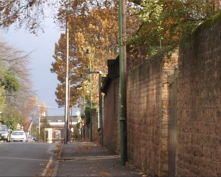
This is a deep space image. There is a lot of shadow definition within this shot. As it was quite sunny. Different intensity levels of colour purity, shadows can be seen.
This is another deep space image. From a long perspective, we are able to view various degrees within the shadows.
This is a Flat space type image. It emphasises the two-dimentional quality of the screen surface and it is opposite to deep space. We tried to find any 2D surface outside, but it was quite hard as the sun was creating a lot of shadows in most objects. Last one is limited space type. It is combination of flat and deep space with 2D bin where there are no shadows and a building behind it complete with shadows and depth.


.JPG)

.JPG)


 2.
2. 3.
3.  4.
4. 5.
5. 6.
6. 

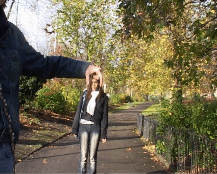 This is ambigours image. Viewers unable to understand the actual size of the objets in the fram. In the group, we used size as a guide to this idea. Here we have a hand holding a person by its head which indicate the size has some what been tampered with.
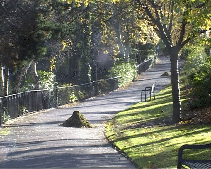
 This is another deep space image. From a long perspective, we are able to view various degrees within the shadows.
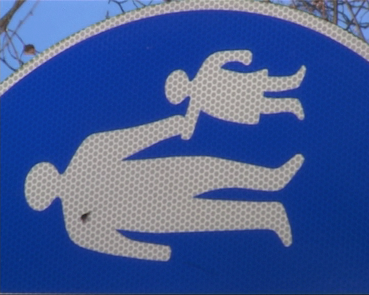 This is a Flat space type image. It emphasises the two-dimentional quality of the screen surface
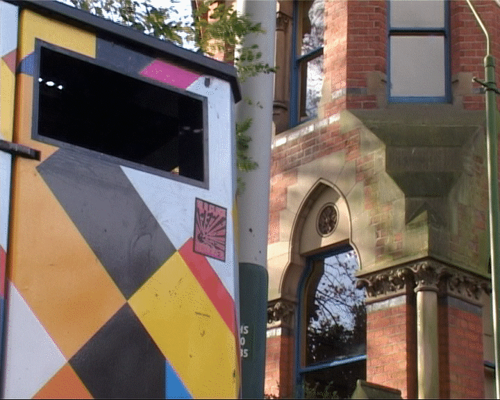 Last one is limited space type. It is combination of flat and deep space with 2D bin where there are no shadows and a building behind it complete with shadows and depth.


